
Canfem

Side Effects Management App for cancer patients, designed to help patients track and report treatment side effects in real time, monitor their progress, and communicate important health information with healthcare providers. It focuses on improving adherence, reducing stress, and making the treatment journey more manageable through an intuitive, patient-centered interface.

Primary Users
Skills
Time line
Client
More Than Tracking A Treatment Companion
Cancer treatment is not just physically exhausting it is emotionally overwhelming.
From
“Is this side effect normal?”
to
“Should I report this to my doctor?”
Patients often struggle to track symptoms consistently, remember medication patterns, and communicate changes clearly during consultations.
Canfem was designed as a calm, structured digital companion helping patients log symptoms in real time, visualize progress, and feel more in control of their treatment journey.
It doesn’t replace medical care.
It strengthens it.
It reduces uncertainty.
It reduces stress.
It turns scattered experiences into structured insights.
Where Design Met Vulnerability
Before designing screens, I focused on understanding the emotional and behavioral landscape of cancer treatment.
Through user interviews and observations with patients and healthcare professionals, I uncovered:
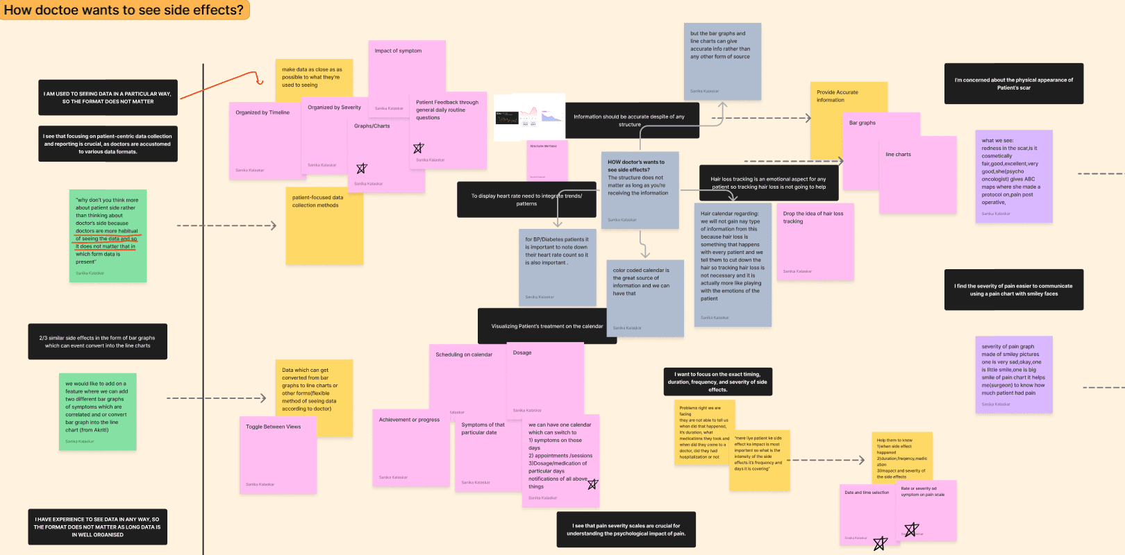
• Difficulty in consistently tracking side effects
• Delayed reporting of symptoms
• Overwhelm due to medical complexity
• Stress during doctor consultations
• Variations in tech literacy across patients
The key insight emerged:
Patients weren’t just managing symptoms
they were managing anxiety, uncertainty, and information overload.
This reframed the problem from “building a tracking tool” to designing a system that reduces cognitive and emotional burden.
Bridged communication between patients and healthcare providers for timely interventions.

Designing for Clarity & Control
The solution focused on simplifying complexity without compromising medical depth.
The app was designed to:
• Enable quick, structured symptom logging
• Visualize treatment progress in an easy-to-understand format
• Simplify medication tracking
• Reduce cognitive load through intuitive flows
• Support varying levels of digital literacy
• Strengthen patient–doctor communication through structured reporting
Every interaction was designed to feel calm, predictable, and supportive — especially during high-stress treatment periods.
Impact & Reflection
The app strengthened treatment adherence by making symptom reporting easier, clearer, and less intimidating.
It helped:
• Encourage real-time side effect tracking
• Improve structured communication with healthcare providers
• Reduce stress around treatment monitoring
• Give patients a stronger sense of control over their journey
The impact wasn’t decorative it was deeply human.
This project reinforced that in healthcare design:
Empathy must lead structure.
Clarity reduces anxiety.
And small usability decisions can meaningfully affect vulnerable lives.

